Considering the Underused Planar Slider Component in User Interfaces
Article Purpose
The purpose of this article is to encourage UI designers and developers to consider the planar slider as a component to leverage in user interfaces as opposed to simply defaulting to the traditional track slider.
I will start by briefly delving into what constitutes a slider in addition to reviewing the types and variations. Next I will discuss the core strengths and weaknesses of the planar slider in comparison to the track slider. Lastly, I will propose ideas regarding the ideal uses of planar sliders.
Slider Types
Sliders let users make selections within ranges or a range of values.
Sliders are ideal components for adjusting values that reflect intensity levels. Common sliders allow adjustment within a single range of values (typically x or y axis). Uncommon sliders allow adjustment within dual ranges of values (typically x and y axis).
There are two types of sliders:
- Track Slider (single range)
- Planar Slider (dual range)

Example minimalist track slider

Example minimalist planar slider
Track sliders allow a user to select a single value within a range or multiple values within a user defined range. Planar sliders allow a user to select two distinct values within two distinct ranges. Track sliders are common. Planar sliders are uncommon, but allow twice the output for the same input compared to a track slider. This occurs naturally as track sliders are one dimensional where planar sliders are two dimensional.
Example single range sliders enable time or brightness or volume adjustment. Example dual range sliders enable time and speed or brightness and saturation or volume and pitch adjustment simultaneously. Again, dual range sliders provide twice the output compared to single range sliders.
Slider Variations
Both slider types have two range variations as noted in the Material Design Spec:
- Continuous
- Discreet
Example continuous track slider
(source Material Design Spec)
Example discreet track slider
(source Material Design Spec)
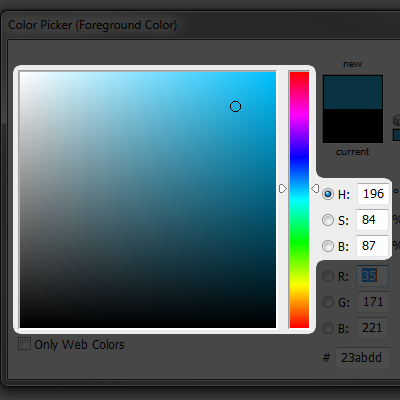
Example continuous planar slider
(Adobe Photoshop)
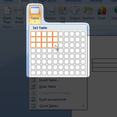
Example discreet planar slider
(Microsoft Word)
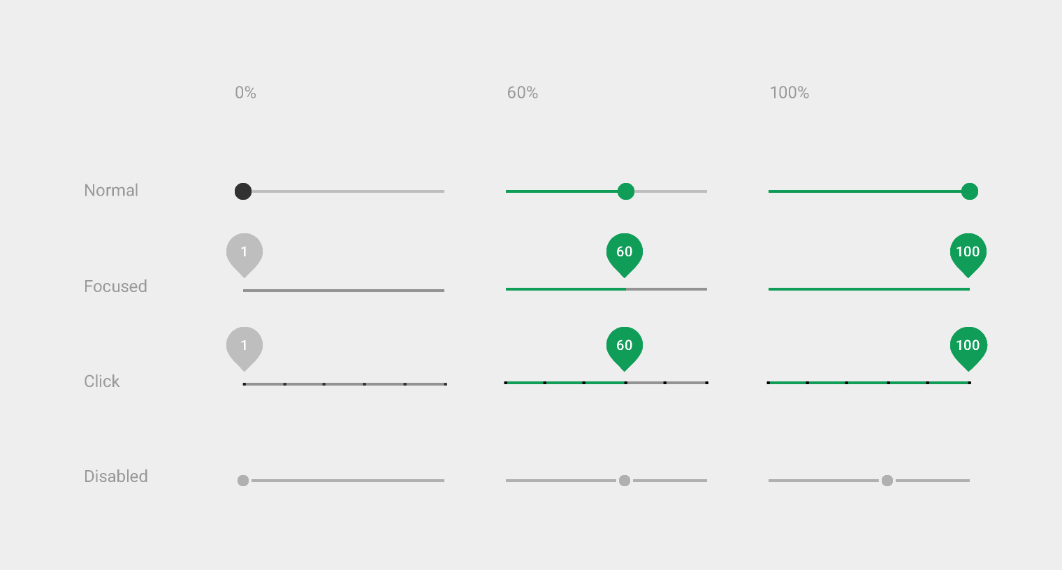
A continuous slider allows a user to select virtually any value within the provided range(s). A discreet slider enforces a user’s selection to confine to discreet intervals. For example a continuous track slider for time may allow selection to the minute whereas a discreet track slider for time enforces selection in fifteen minute intervals.
Track Slider (Single Range)
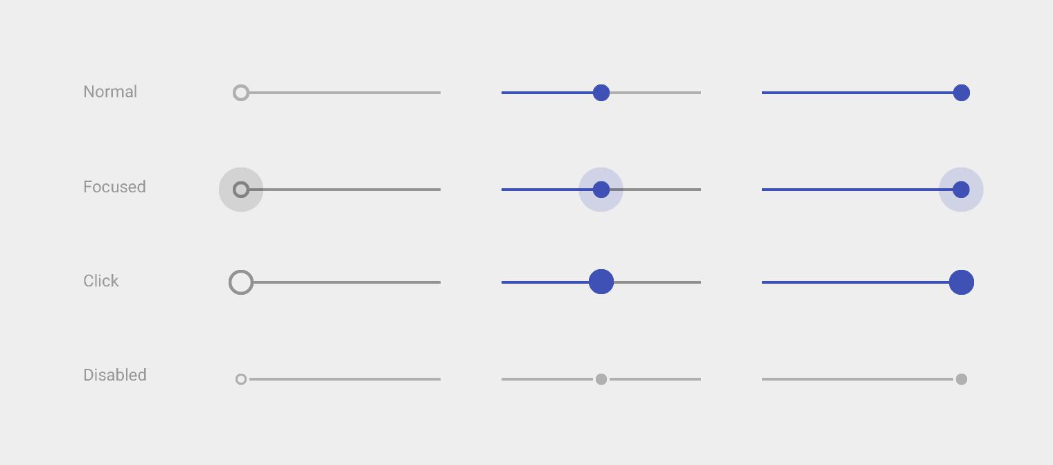
Track sliders are composed of a track that guides one or two movable thumb objects. The beginning and end point of a track represent the range minimum and maximum respectively. A track’s alignment in a UI, from most to least common, is horizontal, vertical, arced, or looped. A thumb’s shape is most commonly a circle, but it can technically take any form.
A track’s beginning and end point clamp a thumb’s movement. A thumb’s moving and idle position on the track represents a single selected value within the track’s range. When two thumbs are on a track, the first thumb’s position represents a selected range minimum and the second thumb’s position represents a selected range maximum.
Track sliders with a single thumb allow a user to select a single value within a range on a track. Track sliders with dual thumbs allow a user to select multiple values by defining an inner range within a system enforced outer range on a track.
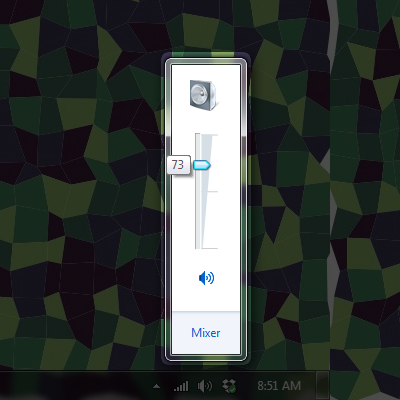
Example single thumb vertical track slider
(Windows OS)
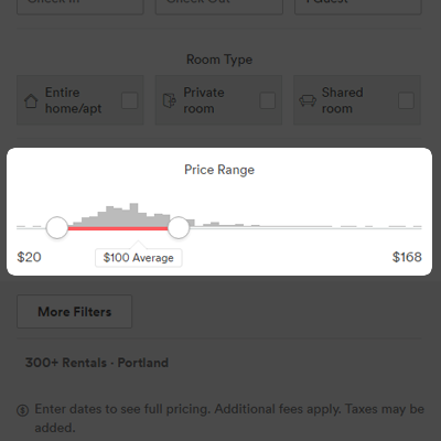
Example dual thumbs horizontal track slider
(Airbnb)
Planar Slider (Dual Range)
Planar sliders are composed of a rectangular plane whose bounds clamp at least one movable thumb object. The rectangular plane can be visible or inferred using UI component or screen boundaries. The plane’s left and right bounds represent the horizontal range’s minimum and maximum values respectively. The plane’s bottom and top bounds represent the vertical range’s minimum and maximum values respectively. The thumb shape is most commonly a circle, but it can technically take any form. In some cases the thumb is replaced entirely by the system cursor, but the behavior is the same.
The planar bounds clamp each thumb’s movement. The thumb’s moving and idle position within the plane represents a single selected value on the horizontal axis and a single selected value on the vertical axis simultaneously. Track sliders can morph temporarily into planar sliders during thumb movement if a single range value benefits from an additional axis of movement to modify or multiply it.
Planar sliders allow a user to select two distinct values from two distinct ranges for each thumb’s horizontal and vertical position within a rectangular plane.

Example track-to-planar-slider morph
(YouTube)
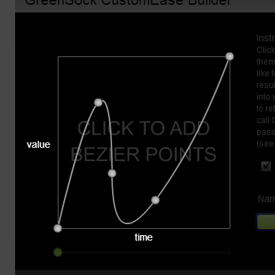
Example planar slider multiple thumbs
(GreenSock)
Strengths and Weaknesses
I feel the majority of UI designers and developers today default too early to the common and preexisting UI components to comprise their designs. Slider components are no exception. This approach is often valid because users are familiar with these components, their affordances, how they work, and what they do. This is really great. However, I think it is worth investigating underused or even new ways to empower a user to achieve goals through the microinteractions of our products.
At best, improvements to the UI and UX of our products manifest quantitatively as more output with lesser or equal input (as is the case with the planar slider) and/or qualitatively as solutions that delight or fulfill the Aesthetic-Usability Effect. At worst, the default and traditional components may be used.
Planar slider weaknesses:
- takes up more UI real estate (if expanded by default)
- designers and developers must consider the control being clipped by other UI elements or the screen bounds when expanded relatively (ideal example below)
Planar slider strengths:
- twice the output for the same user input
Ideal Planar Slider Use
I think the strength of planar sliders, especially when multiple instances are used, provide users great power in that they can get more done quicker. This can improve UX greatly as the user may feel empowered by achieving more output with less input.
The most fitting applications for planar sliders seem to be editors and authoring tools though applications of all types may benefit. I believe the ideal use of planar sliders, in terms of layout, is to start in an inline contracted style and upon interaction transition to a popup style. The Microsoft Word (creating a table) example above embodies this style. This allows the idle state of the UI to be minimal where user initiated interaction results in the editable popup before contracting back.
Below is a sample of the ideal use I envision. It takes the aforementioned inline-contracted-to-popup style a step further. Take note that the popup's position changes so the user is always making edits relative the previous edit. Again, take note that the popup opens, allows editing, and closes in one seamless down (open) > slide (edit) > up (close) interaction flow. This is better than requiring click/tap to toggle the popup open before interacting which requires more user actions.
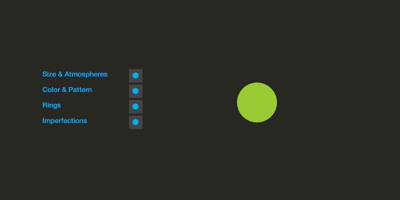
Example ideal planar slider use
(Planet Gen - Creative Editor WIP)
Conclusion
As always, the controls you choose for a UI depend on the problem you're trying to solve and their synergy with your product's content and UI. Though I propose an "ideal" use, this ideal is based on minimalism and may not make sense in all cases. To recap my proposed ideal use, a planar slider:
- Displays in an inline contracted style when idle
- Displays in a popup style on pointer/touch "down"
- When popup open transition occurs, open relative to last edited thumb position
- Update values based on x and y axis "move"
- Close to inline contracted style on pointer/touch "up"
- When popup close transition occurs, ensure the last edited thumb's position is mapped to the track's transform origin
As always, if you have any thoughts or comments, don't hesitate to contact me on Twitter @derekknox.